Cutting Stripe Creation Time by 80% for Figma Designers
A Figma plugin that cuts stripe creation time from ~3 minutes to 40 seconds
🙍🏻♂️ 1600+ total users
📈 ~25 new users / week
⏱️ 80% reduction in stripe creation time
My Role
Product Designer
Developer
(Solo Project)
Timeframe
10 Weeks
Skills
UX Research
UI Design
Plugin Dev (TypeScript, HTML)
Performance Optimization
Problem Hypothesis
Low-UX plugins were causing designers to fall back to slow, manual methods
Creating stripes in Figma is surprisingly difficult because it lacks built-in patterns and doesn't support the file format commonly used in stripe generators online. Third-party plugins also fail because:
1
Interfaces are unintuitive
No preview for adjustments
2
Blurry, inconsistent output
Low-quality output lowers trust
The best option becomes manual stripe creation, which takes 1-10 minutes with constant tweaking. For a leading design tool, this makes workflows clunky and weakens the perception of Figma's completeness (Note: This issue was finally addressed in May 2025, which validates the demand for this problem).
My hypothesis: Poor visibility, low-quality outputs, and clunky UIs were causing designers to abandon existing stripe plugins for slow, manual methods.
Solution Hypothesis
Simple Stripes directly solves each frustration
This plugin is the best solution to this problem by addressing each problem:
Live preview → instant visibility (reduces drop-off)
Native objects → sharp quality at any scale
Figma design system → 0 learning curve

Process & Iterations: Research Insights
Users needed flexibility, quality, and ease of use
To understand broader pain points, I needed to know what other people were struggling with and how they wanted the plugins to work. I started by exploring a total of 10+ plugin reviews, forums, and user feedback to understand the problem.
Theme 1: Lacking Performance
"Stripes aren't the same width, and the edges get blurry on small stripes and big planes"
Figma Designer
From forums/reviews of different stripe making methods, each had its own tradeoffs. I mapped them out to identify opportunities for improvement: customizable and high-quality.
Using Gradients

Easy to use
Blurry edges
Premade Stripes


Quick presets
Limited customization
Manual Rectangles

Full control
Tedious / slow
Theme 2: Poor Usability
"Hard to visualize what I'm making. The interface feels clunky."
Figma Community Member
Plugins were hard to use because its unintuitive interface made it hard to visualize the output.

No live preview + poor controls = high abandonment
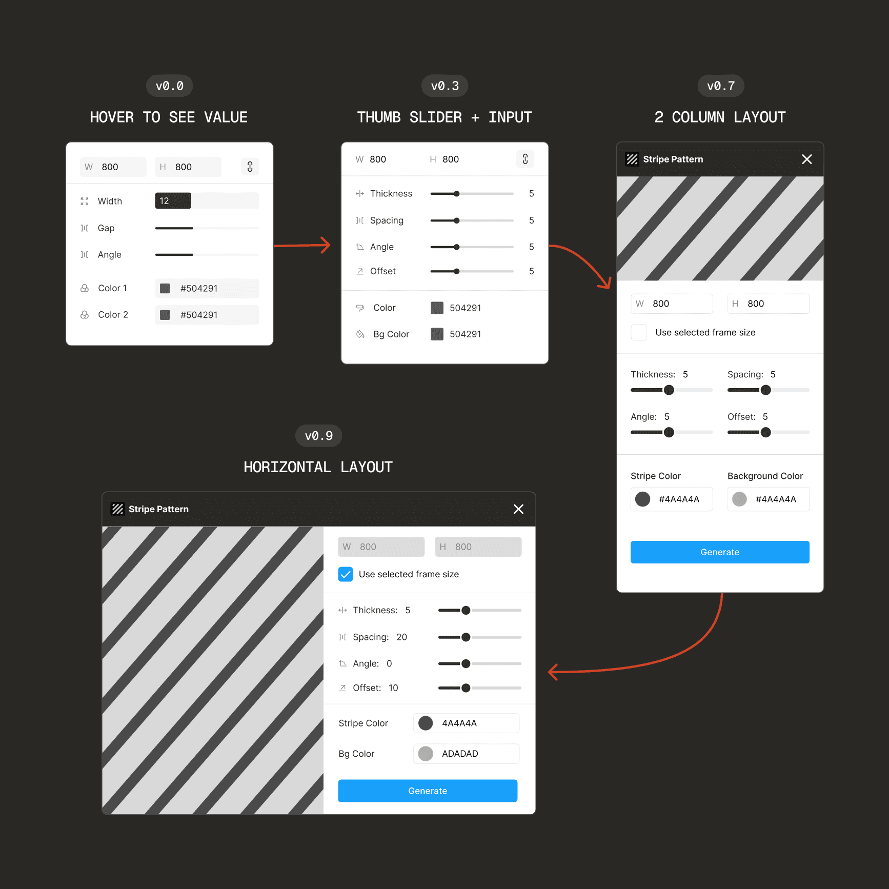
Process & Iterations: Design Decisions
Using UI that is familiar and works
To make workflows simple, I used Figma's UI to make the plugin lightweight and easy to pick up. This lowers the learning curve, streamlines functionality, and aligns with Nielsen's "Consistency and Standards" heuristic.
Sliders vs. input fields
Dynamic workflows needed both the convenience of a slider and the precision of an input field, without overwhelming users with too many control types.
This is why I decided to emulate Figma's UI. The input fields double as sliders when you drag the icon, which keeps the design clean, reduces design time, and feels instantly familiar to Figma users.
Turning constraints into the core solution
My biggest challenge was finding a solution despite these constraints:
Figma's lack of support for repeated SVG patterns
Limited timeframe
Need for a high-quality and customizable solution
I tried improving the gradient-stripe approach, but quality was still poor at large scales. Drawing manually on a canvas took too much time to learn. With these constraints, I moved to a simpler approach: stacking rectangle components in an auto-layout.
While this approach seems simple, it allows for quality and flexibility. Since the stripes are essentially rectangles, users can edit the stripes even after the plugin is closed. This adds a layer of scalability that other solutions were missing.
Less is More (Simplicity)
Because the solution was something the user could create themselves, I had to focus on highlighting the value it brings:
Easy Customization: Each stripe can independently be restyled, recolored, or readjusted any time.
Consistent Quality: Native Figma objects maintain sharp edges at any scale.
Future Proof: Designers can make changes even after the plugin closes.
Adjusting component to make changes even after the plugin is closed
Despite its simplicity, the plugin streamlines workflows for designers, enabling fast, flexible output that adapts to changing needs even when the plugin is closed.
This was the main "pivot" in the project, moving away from creating a "perfect" pattern renderer to embracing native, modular rectangles as the core mechanic. What started as a constraint ended up becoming the main value proposition for scalability and flexibility.
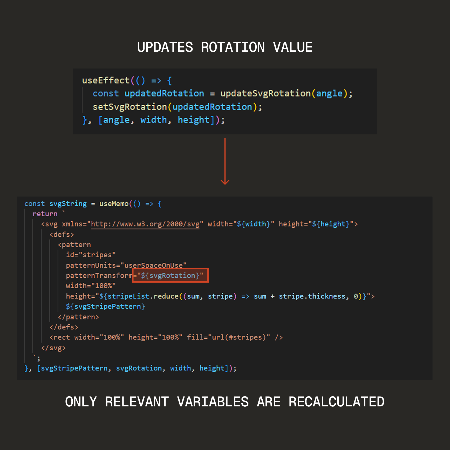
Optimizing performance
During testing, I noticed lag when users rapidly adjusted the slider and moved the mouse quickly. Rather than dismissing this edge case, I had a friend test the plugin and confirmed the same behavior. This taught me:
⭐ Performance isn't just about speed, but it's about maintaining trust in the tool.
Even as an edge case, lag lowers confidence in a tool that's supposed to simplify work. Good UX means users can use their tools however they want and still expect great performance.
I fixed this by recalculating only the parts of code that changed (partial rendering), cutting ~500ms lag down to ~0ms and keeping the UI feeling instant.
500+ slider adjustments in <1 second with 0 visible lag
Designing for modularity and control
Other plugins limited customization to one or two stripes. I made each stripe a modular row, which:
Groups color and width in one place (less cognitive load)
Supports unlimited stripes for full creative control
Lets designers drag-and-drop rows to rearrange patterns quickly
Adding, rearranging, and adjusting stripes as modular objects
Light and Dark Mode
Designers work across different environments, so the plugin automatically adapts to light/dark mode preferences. This enables seamless integration with Figma's UI, further reducing friction in the workflow.
Design & Prototypes
Some artifacts from my design process
Lo-fi: Iterating slider + input layers
Code: Variables for partial rendering
Try the shipped plugin!
Impact and Results
Simple Stripes plugin full walkthrough
Saving 80% of time and offering customizability
To quantify time savings, I timed 5 designers to create the same striped pattern manually vs. using Simple Stripes plugin. Users who used the plugin were 80% faster.
Project Metrics
Over 80% faster than manual methods
1,600+ users, with ~25 new users per week
30+ bookmarks by designers using it as their go-to tool
Positive feedback in the Reddit Figma Community

80% time reduction: before and after
Beyond metrics, the plugin solved real usability pain points:
Individual stripe control and modular design gives designers flexibility and ease of use
Live preview and component outputs enhance performance and usability
Clean, familiar UI helps designers feel uninterrupted during their workflows
😀 "This is exactly what I was looking for. Looks great"
sword9mm on r/FigmaDesign
Additional Considerations
What worked
The live preview was satisfying and fast to use because of its instant feedback. The simplicity worried me, but framing its value (flexibility and scalable quality) made it work better than the more complex solution
What I'd do differently
Conducting 10-15 direct user interviews instead of relying on only secondary research from reviews and forums.
Track retention, not just acquisition. Knowing how often users are using the plugin would give me feedback on what features to prioritize next.
Key learnings
Constraints inspire creativity.
At first, Figma's lack of SVG support seemed limiting, but stacking the rectangles became one of the plugin's distinguishing features.
Always show value to users
Since my solution was simple, I had to focus on highlighting its value rather than focusing on the solution itself.
Performance matters, even in edge cases.
The lag during quick adjustments could've lowered users confidence in the plugin.
What's next
Staying close to the community
I will be actively monitoring plugin reviews and emails for user feedback. This allows me to directly improve the product based on actual needs of designers. In addition, these are the next steps:
More customization: Add gradient support for more design flexibility and improve usability
Smarter suggestions: Use AI to recommend stripe colors that match the current palette to reduce decision-making friction
Visual polish: Fix layout shifts at certain breakpoints to improve edge cases
Thanks for reading!
Check out the next case study

TikTok Redesign
Reducing TikTok Burnout to Boost User Retention
Brand Research, Feature Analysis, User Journey, Prototype